CliqGroup Rebranding
Why the Change?
As CLIQ Digital transitioned into CLIQ Group — a parent company structure — we needed a brand identity to match. I led the rebranding effort as Lead Designer in the Communications Department, tasked with shaping a new visual language for a company entering a new phase.
The old logo lacked meaning and flexibility. It didn’t reflect the company’s maturity, and there was no design system to support future growth. We needed something timeless, symbolic, and structured — a brand that could evolve with us.

Design Philosophy
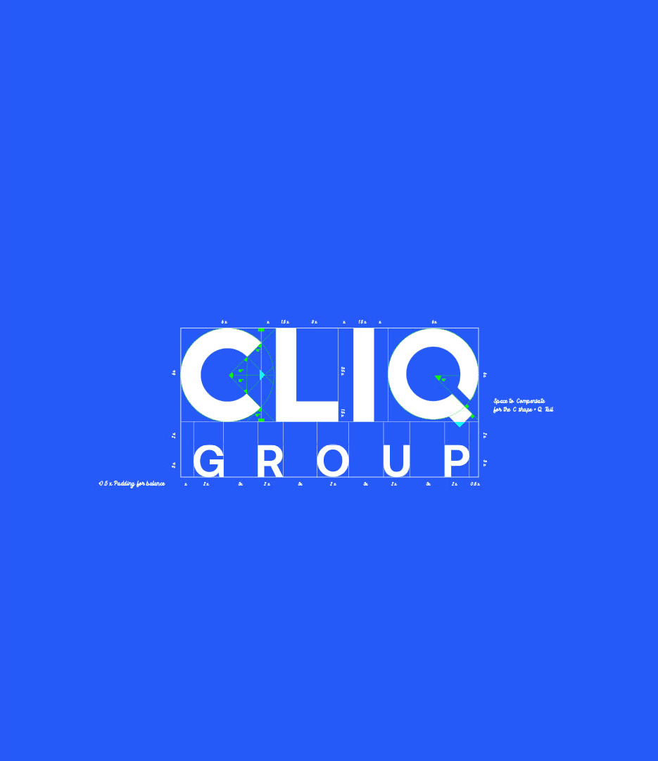
We considered two directions: a complete rebrand or an evolution of what we had. We chose evolution. Instead of discarding the past, we built on it , refining the logo, adding depth, and creating meaning.
We introduced a subtle search icon in the negative space of the “Q”. A nod to our performance marketing roots. The letters were strengthened to give the brand a bolder, more confident presence. We moved from monochrome to a vivid, saturated blue — a color that felt credible, digital, and human.


The Visual Identity
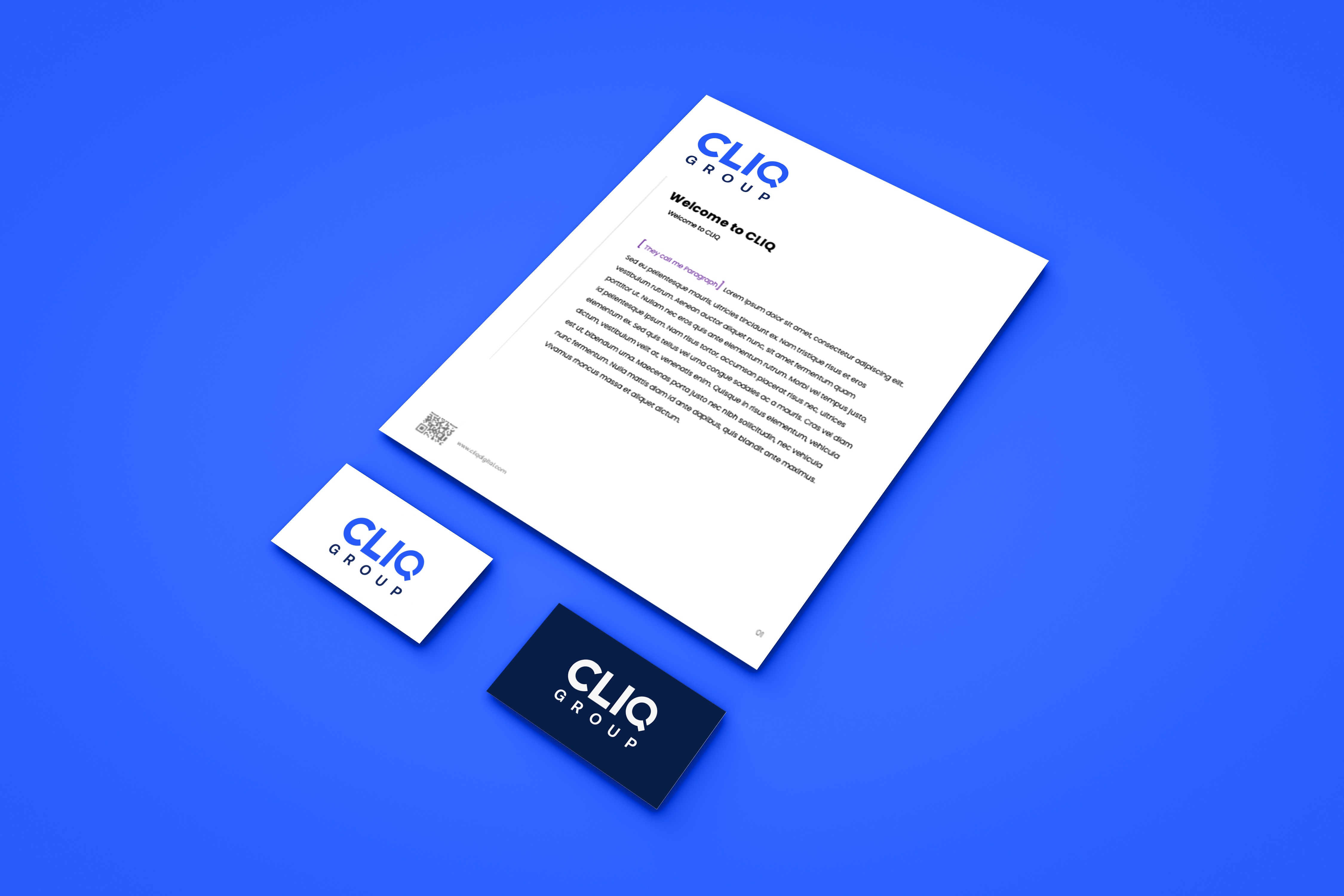
Beyond the logo, we built a full visual system. Typography rules, a flexible color palette, motion behaviors, iconography, and layouts all designed to bring consistency and clarity across every touchpoint.
The system was made to scale. Whether it’s investor decks, social posts, or motion graphics, teams now have the tools to create with confidence and cohesion.


The Outcome
The new identity positioned CLIQ Group as bold, trusted, and future-ready. It brought structure where there was none and meaning where it was missing.
This wasn’t just a redesign it was a strategic evolution. A brand that finally reflects who we are, and where we’re going.